Mondrian inspired work

Pieter Cornelis “Piet” Mondriaan was an important member of the De Stijl movement, founded in 1917, which sought to reduce their art to pure abstraction and simple form and color. Often this meant using only straight lines and primary colors in the work they produced. Mondrian (he dropped the second ‘a’ to fit in with the Paris art scene) is perhaps best known for his grid-based paintings that follow this form of “neoplasticism,” as shown in Composition II in Red, Blue, and Yellow, painted in 1930.

I have always liked the simplicity and boldness of this art and a couple of years ago I created some digital art that was inspired by it, although I modified the form by using using lines that intersected at angles other than 90 degrees in place of strict perpendiculars associated with Mondrian et al.  More recently I have translated those thoughts into ceramic work that builds on this thought into a three dimensional piece. This is the first piece to come out of the kiln.

170605_Mondrian2

170605_Mondrian1

~Richard


When does an artwork cease to be original?

I was at the Philadelphia Museum of Art (PMA) yesterday for several hours and as I walked in I saw that three artists/restorers were at work retouching/restoring the huge canvas on the ground floor by Marc Chagall, “A Wheatfield on a Summer’s Afternoon.” Later, as I was looking at the works of Marcel Duchamp I noticed on the wall plaque that this famous “Fountain” was actually a 1950 replica of the 1917 original and that, similarly, his 1919 work “50cc of Paris Air” had been “broken and later restored.”

As I was contemplating these pieces the thought came to me – when does an artwork cease to be original? Using these three examples I can understand that artworks deteriorate and may need to be restored, and I fully see the requirement to “preserve” Chagall’s work by retouching, but at what point does it become the restorers work? The original brushstrokes are not preserved. Are the pigments used exactly the same composition and color as the original – in every stroke?

This concept becomes even more problematic in the case of the Duchamp examples.  

When “50cc of Paris Air” was repaired the glass vial may well look the same (well, sort of – it’s hardly an invisible mend), but was it repaired in Paris, in the same place that Duchamp created it? And even if so, it certainly would not contain the same air from 1919 which was no doubt differently polluted than more modern atmosphere. 

170316_Duchamp_ParisAir
Finally, in the case of making a replica piece, what are we to make of this? Is it original art or is it not? I assume that as long as Marcel Duchamp was involved in the process then it is still original, albeit derivative, but if not then is it simply a “worthless copy” created by someone else?

170316_Duchamp_Fountain

And what of the digital world? Almost all my 2-D art is created electronically and exists in multiple backup copies as binary data stored on my laptop and other drives. Where is the original art in this case?

So, a lot of questions – does anyone have any thoughts on this?

~Richard


52 Week Challenge: Week 40

WEEK 40: Portrait: Sitting in a Chair – Either a formal sitting portrait or a re-interpretation of this classic. Photography your subject sitting in a chair.

With the lack of willing models available to me I decided to get creative with this one. At a recent visit to MoMA in New York City I was looking through the blinds in the cafeteria and into the museum’s courtyard below. I took a couple of shots focusing on the blinds and then the courtyard and have merged them, having desaturated the main subjects, to emphasize that they are outside, yet still inside the museum confines.

161231_52Wk40Chair.jpg

~Richard

A new focus from the High Line in NYC

Yesterday’s trip to the Big Apple was a bit of an eye opener for me. Despite trying to get inspired by the dogwood52 challenge that I have forced myself to participate in for the last 19 weeks, I have really been neglecting my photographing activities on the whole. One could say I have lost my focus (appalling pun intended!). Thus, knowing that I would have several hours free time in NYC yesterday I made a point of packing up my bag to include my Panasonic GX-8 with a 20mm f/1.7 and a 45-200mm f/4.0-5.6 lens.

I also took along my trusty Panasonic LX5 and removed its external LVF so that I could keep it handy in my pocket. I thought about getting some decent street/urban shots but, to be honest, I still feel very self-conscious about this and don’t want to intrude too much into people’s lives. It’s just my opinion, but I strongly believe that the ways of the Garry Winogrand “in yer face” approach are long-gone and people are much more suspicious and unforgiving than they were even 20 years ago. I want to get home in one piece.

Anyhow, as I mentioned yesterday I took a leisurely stroll along the High Line and was pleasantly surprised not only by the art installations but also the views of the buildings and the creativity that has been used in the area. This extends from the place itself into the neighboring buildings and also into some of the graffiti in the area.

160517_HighLine_Skyline_IAC_100EleventhAve

160517_HighLine_Graffiti


Being alone in the city as a tourist can be a little strange; for example, there is no-one to share your thoughts or discoveries with but on the other hand it does afford a time of quiet self-reflection from the normal busy day. I used the time to wander aimlessly along and to “see things again” through my cameras, unfettered by a tight schedule or the wants of others.

160517_HighLine_MattJohnsonSwan
Part of Untitled (Swan) by Matt Johnson


After an hour or so on the High Line, generally making myself a nuisance to other users and drawing some confused looks from tourists, some of whom wondered why the old guy was taking photos of a wall or getting low to the ground*, I felt as though I had reset myself. As I headed up to Central Park it was as if I was able to focus on my photography like I used to.

160517_HighLine_ESB

~Richard

* as an aside this is a great way to get strangers to look at all sorts of odd things and almost start a chain reaction of crowd behavior. It’s surprising just how few people will actually ask what you are trying to see!  


52 week Challenge: week 9

Week 9: Artistic: Shadows – The opposite of light is dark, the absence of light is shadow. Interpret this into a masterpiece.

This was quite an interesting assignment and opened up a lot of possibilities. The one constraint I set myself was that I was only going to use natural light, so no flash or lamps to create shadows that weren’t natural.

I had a trip to Philadelphia, and  in the end settled with a fairly classic abstract taken on the steps of the terrace on Liacouras Walk in Temple University. I converted it to a black and white image as I think it works better for contrasting the zigzag lines onto the grey stone steps.

160301_ShadowTempleSteps

However, last night just as I had returned home from work I caught sight of the shadows cast from a couple of our German Erzgebirge ornaments being cast by the final rays of the setting sun through the window. These are delightful little wooden sun and moon characters and I thought their shadows were lovely, as well as relevant to the time of day.

160301_ShadowSunMoon

In this case I left the image as full color as I think the dark wooden background of the shelf makes the shadows seem warmer, as it partially reflects the sun into a blown out highlight.

~Richard

In the Mind’s Eye – Pareidolia

This morning I saw the face of Ted Cruz in my toast, or was it Donald Trump, or maybe Donald Duck? It doesn’t matter really as the point of today’s wittering is to discuss the familiar concept, but perhaps unfamiliar term, pareidolia.

Scarcely a day goes by without someone posting on social media that they have seen the face of the Lord (or rather that of Mel Gibson, Robert Powell, or a Renaissance depiction thereof, since no contemporary sketch of Jesus actually exists) in a whole host of everyday objects from avocados to zucchinis. Similarly, when we were kids, and perhaps even now, we’d look up at the clouds and recognize an odd shape (other than a sheep!)

So, what is this all about then?

Pareidolia (/pærᵻˈdoʊliə/ parr-i-doh-lee-ə) is the condition where the human brain looks at an object and also perceives a familiar pattern in that object that simply isn’t there (such as a face). It seems to be an innate characteristic of human beings, probably because we not only have well developed visual processing but, more importantly, because of our cognitive wiring, so to speak. It seems to hinge on us being hard-wired for rapid pattern recognition so that we have a shortcut to enable our brains to quickly identify familiar objects for binary decision making (safe or unsafe, friend or foe, etc.). Pareidolia is when this falls apart slightly and perhaps we miss the visual cues slightly. However, as the visual signal is processed so quickly against our internal reference we cannot help but “see” the object that isn’t really there..

There are many examples of this but perhaps the most (in)famous forced use of the condition is the Rorschach inkblot test which attempts to evoke this state and determine an individual’s mental state based on what the “average” person would see.

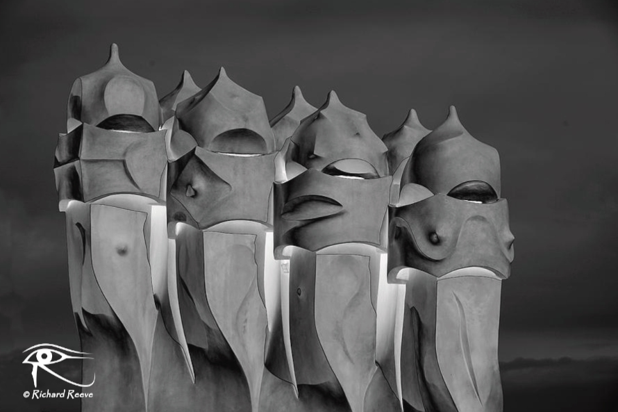
However, it also can be used for some interesting artistic effects too.

For example, I was walking in our garden one day and saw the poppy below which reminded me of an angel simply because of the way the petals fell.

160219_PoppyAngel

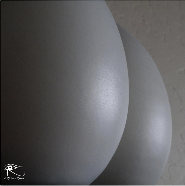
Or, by careful choice of camera angle, I was able to evoke another visual interpretation of these two gray vases on a shelf 😉

160219_Perception1
One thing is for certain, it’s a phenomenon that isn’t going to go away, so why not have some fun and  incorporate it in your next artistic endeavor?

~Richard

A Story – The Chain

Hanging in the park was a chain. He saw it and wondered what it may be attached to. Looking up it disappeared into the clouds high above. Strangely, it was still, as if attached to the ground, yet the end was dangling free. He couldn’t resist the urge to reach out and touch it. Lightly at first, as if it wasn’t real, then he grabbed it and tugged at it. Nothing happened. Very odd, he thought. Gripping tightly with both hands he tugged as hard as he could. It didn’t budge. Now he was really intrigued. Looking round to see if anyone was there, and feeling a little self conscious, he grasped the chain firmly and started to climb…

The Chain

~Richard

The Art of QR Codes

GX1_QRBlack

You have probably seen these weird looking blocks of black and white squares on packages and leaflets, and even on the billboards and buildings, but do you really understand what they are and how you can benefit from them as an artist?

What is a QR code?

Over the last several decades we have all become used to barcodes, with their characteristic zebra-stripes, being printed on all our packaging to make stock control easy in the supermarket and beyond, but in the last few years you may also have noticed the quiet arrival of a new variant of this object in the shape of a black and white set of dots in a square shape. This is a new form of 2-dimensional barcode called a Quick Response code, or QR code, which is able to convey a lot more information than the old stripey barcodes in a format that all users of common modern technology can use without a laser in sight. These squares of high contrast are not only used to identify a product but can also provide a quick link to a website for further information. Unique QR codes can, in fact, be created and used by anyone to allow quick access to anything accessible by a URL. This means we can now use them to drive potential customers to our online art portfolios, or even specific artwork, blog postings, or anything else  without worrying about spelling errors or mistyping of long web addresses.

How does it all work?

The first thing that anyone needs to be able to use a QR code is a smartphone with a camera and access to the internet. The next thing to do is to download an app that can read QR codes and then you are ready to start your journey. There are many QR code readers available for iOS and android users, some free (usually with a few, fairly unobtrusive adverts) and others that cost a few bucks. Just search your app store for “QR reader” and see what’s available.

Once you have this installed all you have to do is start the app, line the camera up with any QR code you find, and let the camera focus on it. You don’t even have to press the shutter button as the phone will do the rest for you. As soon as the app recognizes the QR code it will use your web browser to open up the page to which the QR code has sent it, and you can view the site.  It really is that quick and easy!

How to generate a QR code

It shouldn’t take you long to realize the potential for this as a marketing tool for your artwork. This little black and white square offers a foolproof way for people to quickly locate any page you want from their phone. All you have to do is generate your code and use it somewhere where others can find it.

Again, the web comes to our rescue, and a simple search for “QR code generator” will provide you with a wealth of choices. I use the google generator app so I will explain how this works, although other generators are very similar.

Go to the web page, and in the URL box type the web address where you want the QR code to point. This could be your artist site, personal site, even a specific gallery or image web address (just copy and paste from the address bar of your own site). You will see a QR code instantly generated for you by the software. You can even check the image now by pointing your QR scanner-equipped smartphone at your computer screen to see it work instantly!  Next, you save this code to your computer, usually as a PNG file for later use. With google you can also choose how big you want the image to be and also if you want margins (white space). It’s all personal choice and depends on what you want to do with it.

How to use a QR code

Now you have your personal QR code downloaded onto your computer – what next? Well, as a PNG file you can load it into your image processing software, word processor, or any other application that will accept an image. How you want to use this is really up to your own creativity.

QR Pointillism - Big Ben I

I started off by printing it on cards and stickers to put on the back of my photographs and exhibition entries, along with my printed name and web address. Then I progressed to a self-inking stamp from VistaPrint (since this QR code can be uploaded as a logo) for a more professional look. By experimenting I found that the color of the image really has no effect on its usability so I have also created a few abstract images based on my QR code for my art gallery. Finally, I like to include it in any written work I do too. I have even defined this as one of my brushes in GIMP so I can include it in it any image I want as a watermark or overlay.

The bottom line is that QR codes can be interesting abstract images in themselves and can be used in any way you want knowing that every appearance is a subtle advertisement for your work!

If you are prepared to invest a relatively short amount of time learning how to use QR codes and a little more time thinking about how you can use them creatively. You could find them an inexpensive way of driving a few more potential customers to your online galleries.

~Richard

Blog at WordPress.com.

Up ↑

MrReid.org

Stuff that interests Mr Reid, a physicist and teacher

From 1 Blogger 2 Another

Sharing Great Blog Posts

Journeys Through Pre-World War 3 Britain

Travelling the overcast isles

cancer killing recipe

Inspiration for meeting life's challenges.

the poet's billow

a resource for moving poetry

My Cynical Heart

Welcome to my world.

Rustic Rumination

Mind over matter

Stephen Liddell

Musings on a mad world

thisisyouth

Travel. Climbing. Characters. True stories, well told.

OPOD blog

Adventuring the globe whilst based in the beautiful PNW, with a focus on fitness & adventure travel, conservation and a healthy balanced lifestyle. All with my beautiful partner in crime, Stephanie!

Fictionspawn

Games, Illustrations and Short Stories

RPR Consulting, Inc

Success By Design

Back to Blighty

A returning expat's perspective of Britain

Sauce Box

Never get lost in the Sauce

Jim Kayalar Photography

Photo Book Store

DADDYSCUISINE

Happy Eating

in cahoots with muddy boots

Cooking, gardening, traveling and photographing around the globe

P e d r o L

storytelling the world

%d bloggers like this: